Project Overview


The CDC needed an external review of multiple sections of their site to gauge how their content was being presented from a usability standpoint. A Heuristic Evaluation was determined to be the best way to evaluate the various sections of the website and their established WCMS design system.

Heuristic Evaluation Definition

Examination of an interface to judge its compliance with recognized usability principles and best practices (the “heuristics”).

– NN/g Nielson Norman Group (http://www.nngroup.com)

The Heuristics Used

  • Consistency
    Users should not have to wonder whether different words, situations, or actions mean the same thing across the interface. Look and feel should be consistent throughout the system.
  • Standardization
    The interface uses a predetermined set of standards and keeps within them throughout the site with minimal custom modules. Follows commonly used web conventions.
  • Cognitive Load
    Minimize the user’s memory load by making objects, actions, and options visible. Instructions for use of the system should be visible or easily retrievable whenever appropriate. An appropriate amount of information should be displayed on screen as to not overload the user.
  • Navigational Effort
    Content within the system follows commonly used web conventions. Labels are clearly marked and identifiable throughout the system.
  • Aesthetic Integrity
    The interface will have an attractive and appropriate design according to the established design guidelines. Dialogues should not contain information which is irrelevant or rarely needed.
  • Information Architecture
    Content should be organized in parent/child relationships within respective subject content. High value content should be easily accessible in appropriate locations.
  • Recognition
    Content should be easily scannable to identify key areas of interest.
    User flow should follow common web conventions in order to ease cognitive load.
  • Linguistic Clarity
    The system interface will communicate as effectively and efficiently as possible. It will use language that is familiar with the user-base.

Priority Levels

  • Low
    These issues have a low adverse effect on the overall user experience and should be considered and improved upon after high/moderate priority issues have been corrected.
  • Moderate
    These issues have a moderate adverse effect on the overall user experience and should be considered and improved upon as soon as possible.
  • High
    These issues have a high adverse effect on the overall user experience and should be considered and improved immediately.

Evaluations

Visually Overloading the User (High Priority)

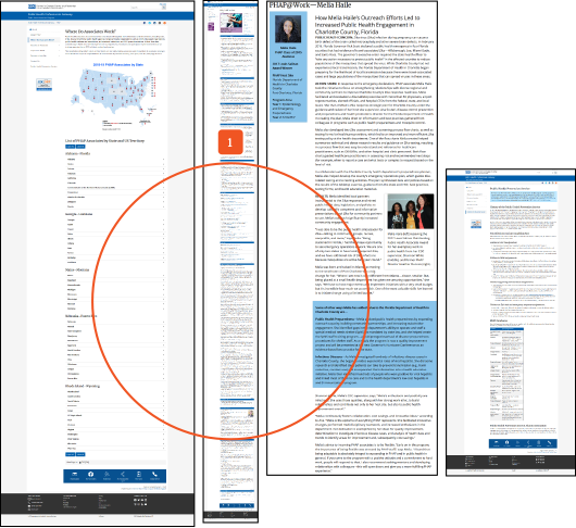
  1. The amount of content per page in some cases can very high and will overwhelm the user. It is often difficult to scan a page with a high word count for valuable content due to the lack of spacing between text and/or content blocks. A page should be easily scannable with clear breaks where a section begins and ends.
  2. Spacing between sections, headers, subheadings, and content needs to be increased to help the user with scanning a page and overall readability. On pages with high word count, as shown, dividing content into new pages would allow the user to find content that is most useful quickly.

Information Architecture of About (Moderate Priority)

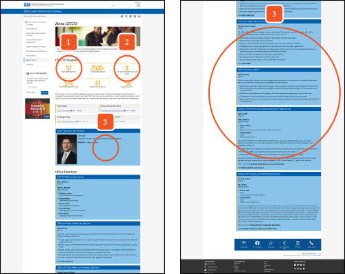
  1. The Support section should use text for the numbered data to reduce issues later when updating content.
  2. Spacing between the numbers and respective copy to enhance readability.
  3. Select one item to be a prominent resource. The office directory uses heavy elements to indicate importance, but due to it’s size, it will overload the user and clear indication of important content will be lost. Modules in the Office Directory would be better suited with a gray heading and content container.

Visual Inconsistencies (Low Priority)

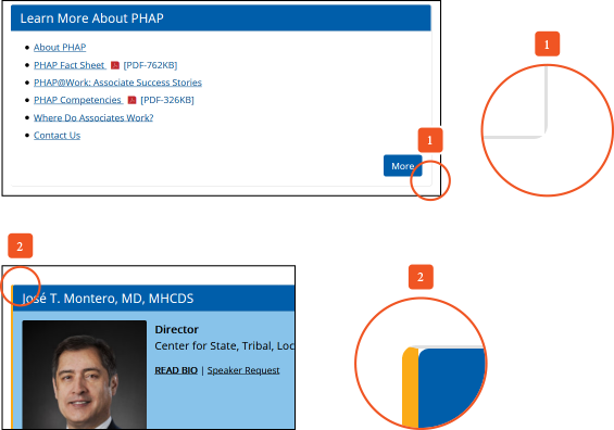
  1. The intended CSS is not configured properly and the card design is rendering incorrectly with a gap in the rounded corners. Adding the appropriate CSS will fix the issue.
  2. Part of the interior of this card is getting it’s corner rounded and creating a gap. Adding the appropriate CSS will fix the issue.

Conclusions

Issues with information architecture was a consistent issue throughout the pages, often noting the cognitive load it places on the user to distill large quantities of information. Separating content out into focused pages will help users find what they need faster. Frequently accessed information was often hard to navigate to without the use of search when it should be placed in high visibility areas within specific pages.

Visually, the pages would benefit from including additional visual aids to guide the user to areas of interest. The use of bold colors (where your eyes naturally move first) on multiple elements throughout the pages created issues on what was important, increasing the cognitive load placed on the user. The use of pure black text on a white background has a very high contrast rate and can reduce the reading stamina in a user, especially when dealing with large blocks of text (more on that here).

Often, pages were not using the established style guide correctly and it was continually creating usability issues throughout. Alerts needed on specific pages were showing in unnecessary pages, custom modules were being used, and some css issues were found within certain modules.


*This is a very condensed version of the overall evaluation.

If you’d like to read the entire review, I’d be happy to share upon request.

Other Details

This was about a 2 week project, completed in May of 2020.

I worked with Viscid, a former digital agency based in Tysons, VA.