CHALLENGE
CrossFit Metropolis was in transition mode and needed a better online presence in order to appeal to their diverse audience. The site needed to reduce content, focus on core offerings, and remove any hurdles to new potential members.

CrossFit Metropolis was in transition mode and needed a better online presence in order to appeal to their diverse audience. The site needed to reduce content, focus on core offerings, and remove any hurdles to new potential members.
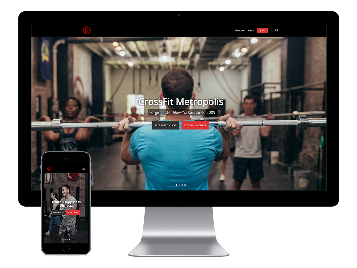
Website was revamped with a clean look, simplified content, and made it simpler to sign up. Professional photography was used to showcase their offerings, tie emotion into the marketing messages, and set their site above any other CrossFit gym in NYC.


Behind the design:
Content on page was drastically reduced after getting feedback from current members and understanding that previous days workouts aren’t as relevant on the day they visit the site, only the latest WOD (workout of the day) would be relevant to them. Numerous links were removed or moved to the footer because they weren’t getting much traffic and only made the homepage look busy and cluttered. Because the site is for a variety of people (current and potential members, people with and without CrossFit experience, and anyone just looking for more information on CrossFit), content was condensed with the most important being in the hero-landing area and right below the fold. Information presented in these two areas allowed the website to cater to the 5 types of visitors mentioned above within 3 seconds while retaining a professional look and feel for the site. High quality imagery allows the homepage to convey numerous tones that are effective marketing messages (according to a CFM manager) for potential CrossFit members. These tones include: Building fitter New Yorkers, the fitness program that works for me, community and inclusion that isn’t typically possible through a traditional gym, and health & happiness through fitness.
