PROBLEM


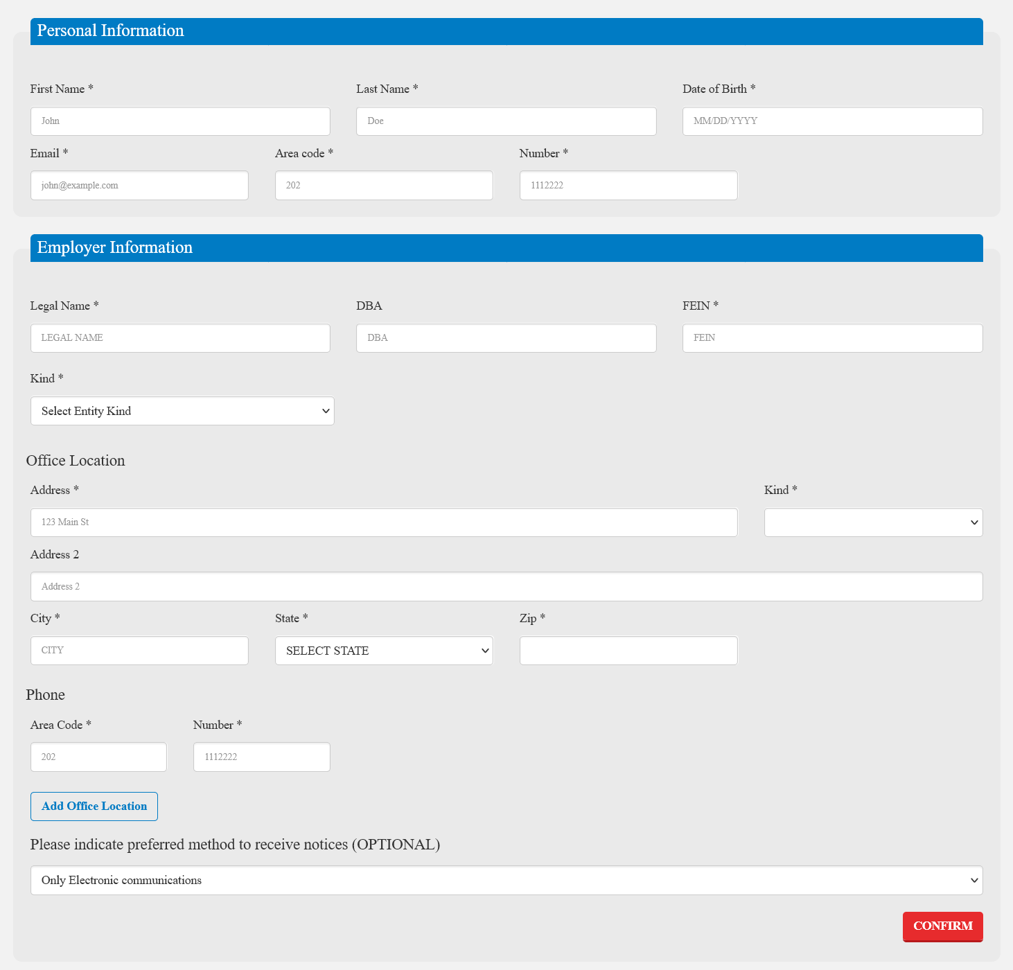
Enroll App, the technology behind numerous State-Based-Marketplaces was difficult to use, had numerous information architecture problems, did not comply with Federal regulations regarding WCAG 2+ (508c), was not built for responsive platforms, and had an outdated look and feel for a modern technology platform. 

SOLUTION


Enroll App was reimagined with a fresh look and feel, improving interaction patterns to help guide the users through the often difficult process of enrolling in healthcare. The updated Enroll App utilizes a mobile-first design through a modern front-end framework, allowing users without regular access to a desktop computer to enroll in healthcare on a mobile device. A design system was built with WCAG 2+ (508c) in mind, ensuring that anything that is utilized going forward will adhere to all accessibility standards. 

My Role

  • Conducting an experience audit of the current SBM platform, identifying pain points, abnormalities in modern web-based navigation, and accessibility issues
  • Research into existing SBM platforms
  • Distillation of data on users of the system
  • Building personas, user stories, and user journeys
  • Creation and maintenance of a new design system to be used throughout the application
  • High-fidelity wireframes to determine the look and feel
  • Continued maintenance of the platform as new healthcare legislation is announced

Deliverables

  • A cohesive design system to improve consistency through the application
  • Interactive wireframes to showcase experience enhancements, new features, and capabilities
  • Updated information architecture to improve user flows
  • Implementation of modern web conventions to improve user understanding
  • Fully WCAG 2+ (508c) compliance to ensure accessibility for all users
  • Mobile and desktop design patterns

This is an ongoing project as of January 2023 and worked on while employed at IdeaCrew, Inc., based out of Washington DC

Process

While not always applicable and varies from project to project, I try to use the process outlined in the following graphic from NN Group as a starting point when determining steps to take throughout a project.

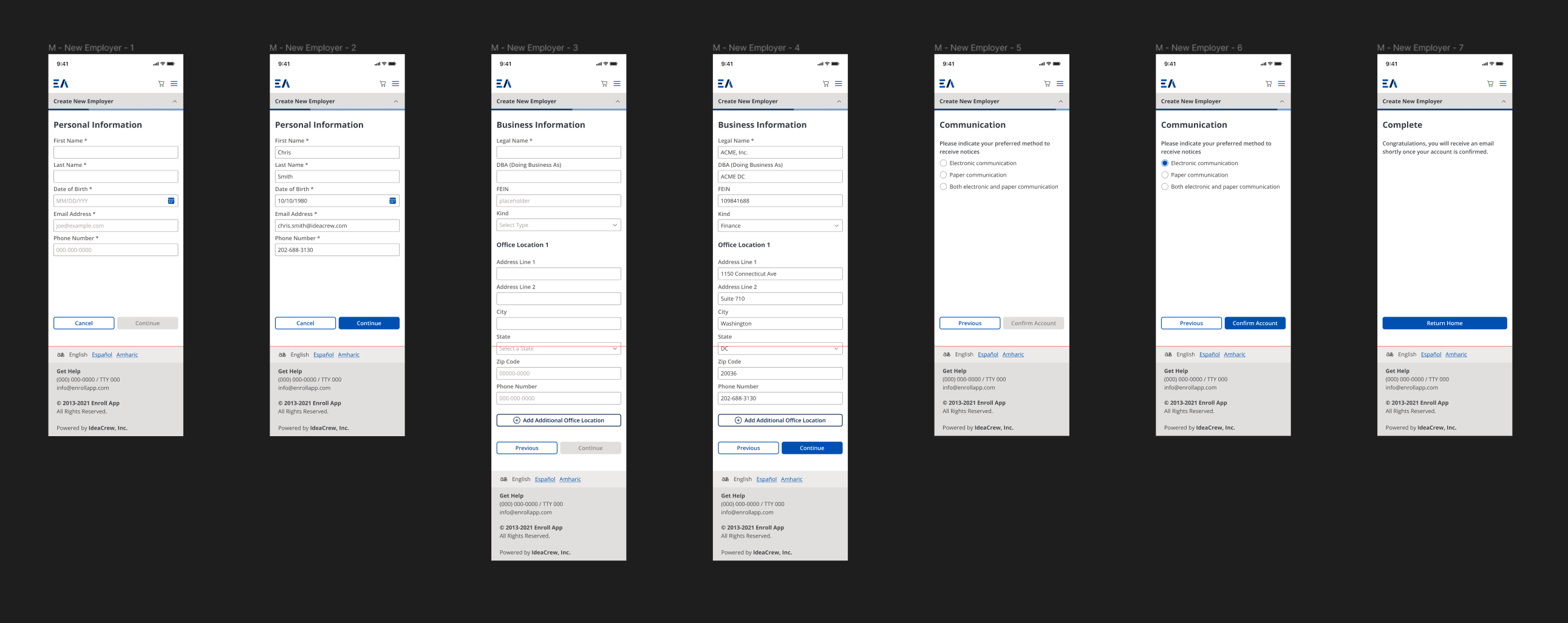
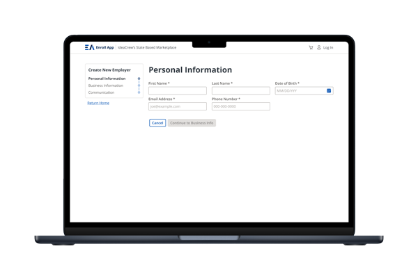
The following design data is an example of a new employer registering for an account to provide healthcare to their employees, a small snippet of the larger application.

1. Identify the Problem

  • Performing an experience audit
  • Checking for issues with:
    • Accessibility (WCAG 2+)
    • Inconsistencies with information architecture, typography, colors, and input fields
    • Areas of confusion or low clarity
    • Overwhelming the user with too much information or too long of a process flow
    • How it performs on a mobile device
    • Improper use of components
    • Choices that disregard common color theories (ie. green = go/positive/success, red=stop/error/delete)
  • Getting access to support ticket logs to understand where errors happen (from the user or from the application)

2. Understanding the user

  • Gathering demographic information (while these can be true, they most certainly are not concrete definites, but more of a generalization of tens of thousands of people)
    • Age – can play a part in how comfortable a user is with technology
    • Location – can possibly determine the level of care and/or medication a user is going to need
    • Income level – a user’s income affects different user flows like the need for Financial Assistance and/or homelessness
    • Family Information – needing a plan for one person vs. a plan for 5 people greatly affects the time to complete enrollment
    • Citizenship – US citizens have a different user flow compared to someone with different citizenship
    • Language – how many people can’t use the application because they don’t know English?
  • Reading reviews of the application
  • Communication with call centers to take note of common errors
  • Analytics of devices used to access the application, mobile/tablet vs. desktop experience

3. Exploration of Solutions

  • Concepts for implementation of proposed features
  • Overall UX enhancements
  • Breaking up long user flows to not overwhelm the user and to ensure usability on a mobile device
  • Feedback and refinements

4. Testing and Refinement

  • Building prototypes within the new design system
  • Feedback from product owners
  • Continued maintenance as new policy gets introduced and new features are added to the current application
  • Ongoing testing and refinement, it’s a living product that needs nurturing as it scales

Results

Through gaining a thorough understanding of the application and identifying pain points present throughout the application, improvements to the user experience were made with modern (and more familiar) web conventions.

Wireframes were created to visually showcase the updated information architecture and user flow improvements with the newly created design system.

A comprehensive list of experience enhancements continues to evolve as new features are added and as healthcare legislation gets passed. Future goals and implementation are still being determined by the product owners.

Results in Action