2 – Building & Feedback
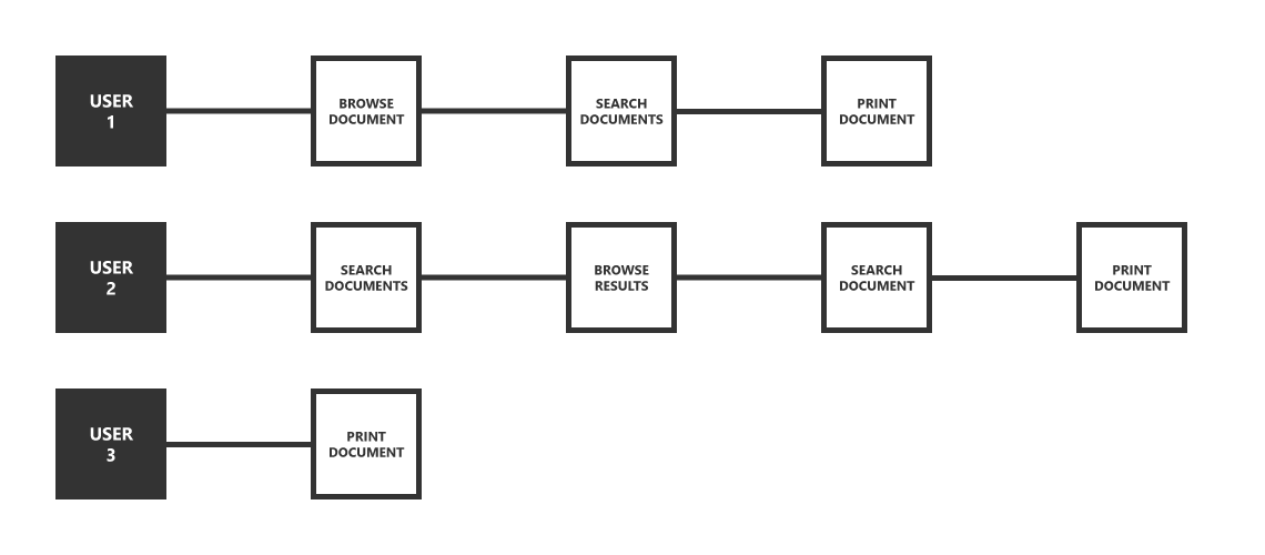
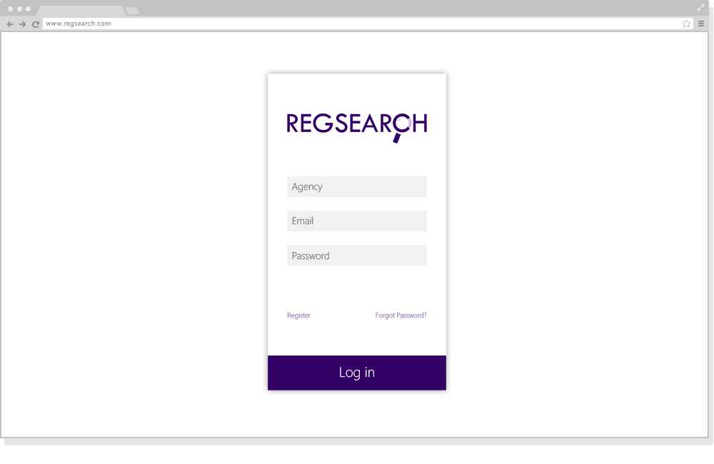
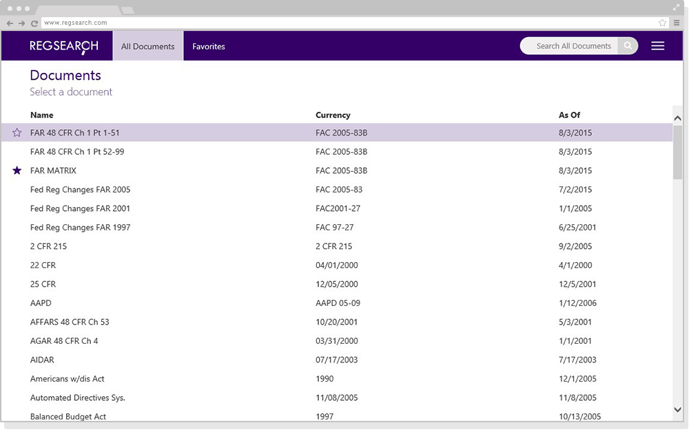
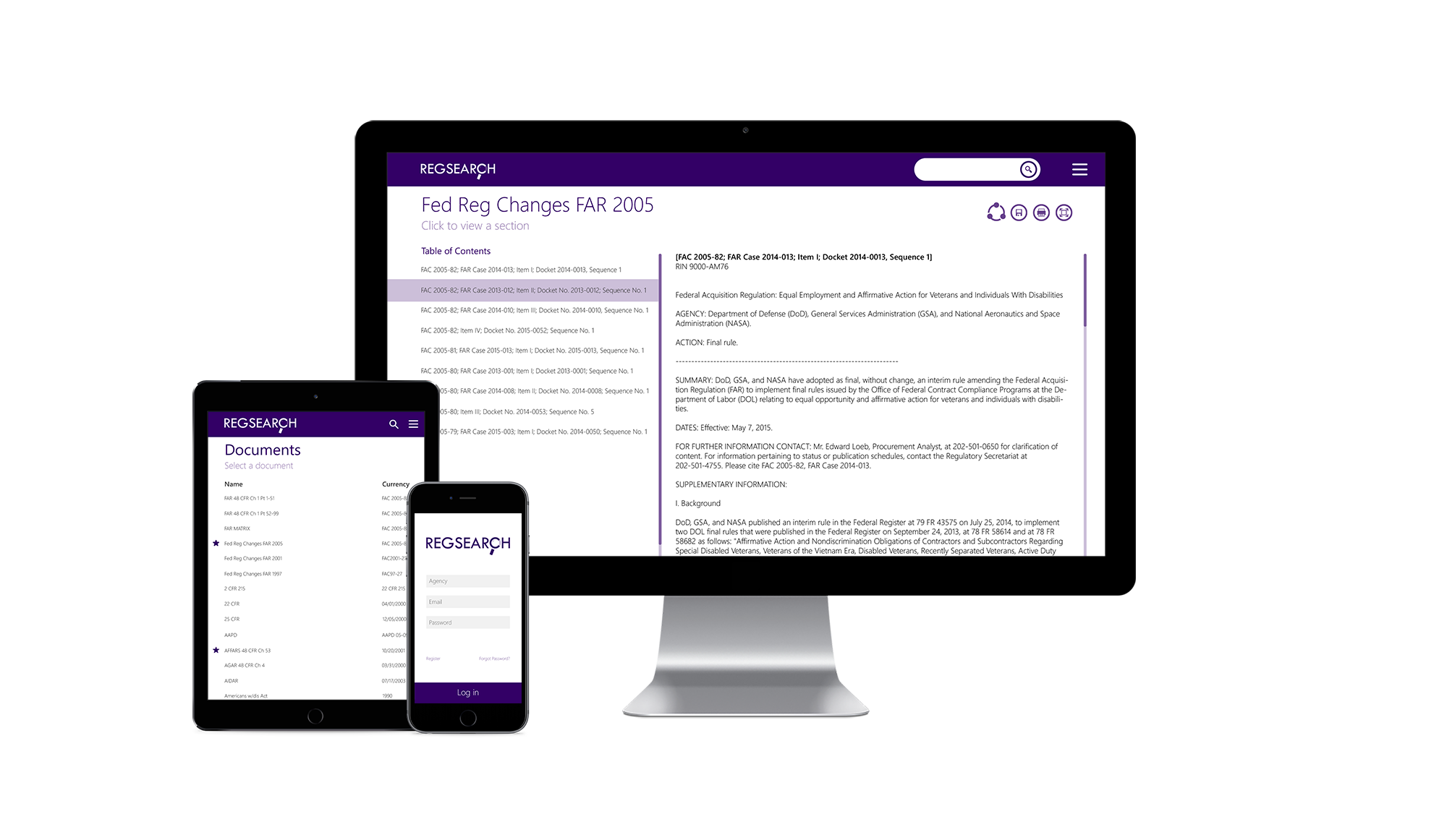
- Build mock ups that reflect a modern user experience and create linear processes for completing research tasks
- After design approved, build alpha version of product with modern web development technologies
- User testing for feedback and understanding user needs for the product
- Refine user experience to remove obstacles and add additional features based on use
- Compare products that aim to accomplish similar tasks
The direction behind the design:
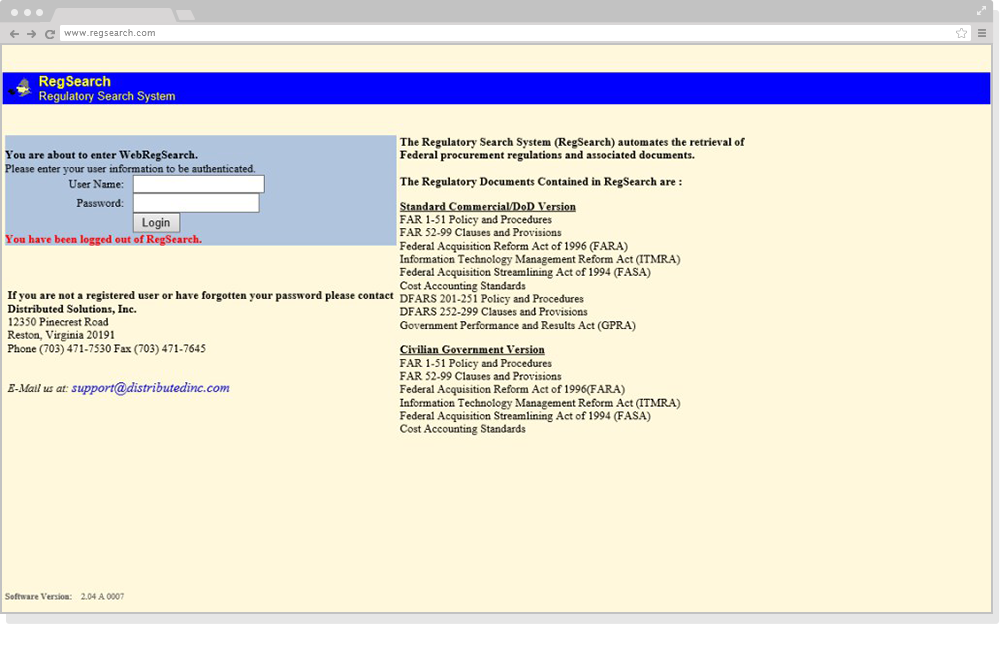
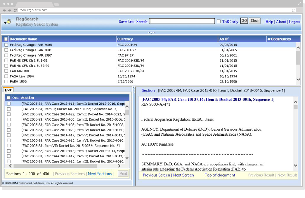
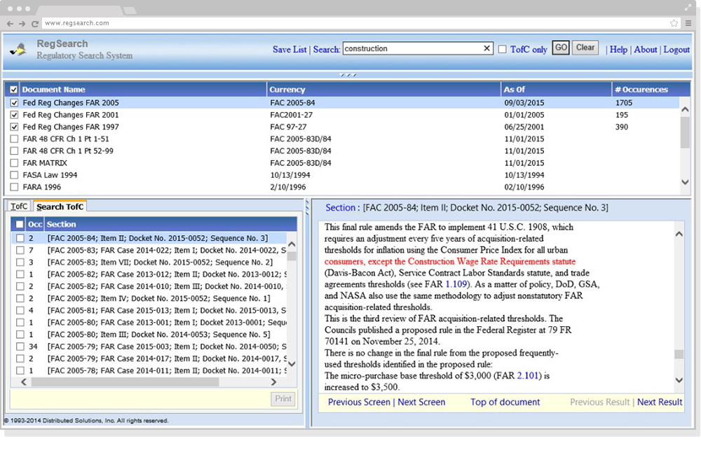
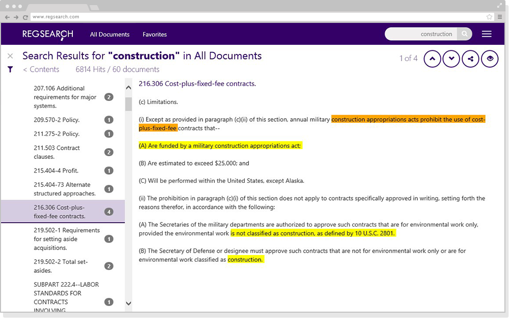
With the main purpose of the software being to find information by within documents, simplicity and large reading panes were at the forefront of the overall design direction. If you look at the screenshots down the page, all content remained visible on screen with the reading pane only consisting of about 25% of the entire window – this was a pain point, only showing relevant content in a quarter of the window. I started off with a basic bootstrap template and slowly started adding the necessary components, keeping the layout as minimal as possible. Previously, check boxes and links were used to complete tasks and features were not intuitive, nor was there any sort of instruction guide within the software – this was another pain point, confusing user interface controls hindered it’s usability. Commonly used icons would be used to assist the user when trying to accomplish more complex tasks within the software. Icon design took inspiration from widely used platforms such as Google’s material design, Bootstrap’s built in icons, as well as Microsoft. Higher contrasting colors were used when highlighting important text from a search, previously it was only red text within a block of black text – this was another pain point we wanted to fix, higher contrast increased readability within a block of text.
